

Yes, your website is mobile friendly, but is it desktop friendly?
With mobile users still on the rise, web developers are trying to stay ahead of the game with a ‘Mobile First’ approach, this in terms means that the user interface and layout on a mobile is built first and any screen sizes larger than this would adapt and expand into more columns.
This concept is good, however we often see this being used too literally by some developers and the desktop user experience is left neglected and reflecting what a user would expect to see on a mobile. It is important to create a separate theme for desktop users.
Contact InSynch for more information
Here are some standards to follow for mobile but not for desktop
The Hamburger Menu

You may not know the name but you will have seen this used on a majority of mobile websites. This is as regarded as the universal icon and is as familiar as a cursor on your desktop.
Reasons it works for mobile:
- Makes good use of space
- Easy to locate and navigate
- Users expect to see this
Reasons it doesn’t work for desktop:
- Adds an additional click to the user navigation
- Items appear vertically, users expect to see a full horizontal menu
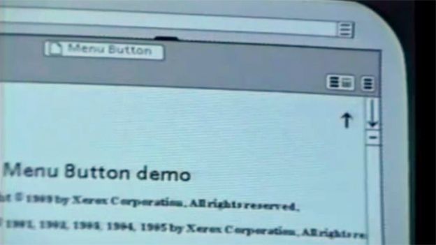
Did you know?
The icon burger comes from the Xerox “Star” personal workstation, one of the earliest graphical user interfaces, designed by Norm Cox
Fill the Space
Mobile websites tend to fill the space of the screen, which is essential, making use of the space for users to scroll and navigate without having to zoom and reduces the risk of ‘clumsy fingers’ (clicking on the wrong link due to objects being too close together)
Reasons it works for mobile:
- Helps to engage users, improving the UX
- Responds to different mobile sizes
- Improves Usability
Reasons it doesn’t work for desktop:
- Layout on very large monitor would fill the entire screen making it more difficult to navigate.
- Line width would be significantly longer, making it harder for users to digest information.
- Images tend to pixelate if not optimised correctly for desktop
Single Column Layout
Depending on your screen size you might see a different amount of columns, this is because a website can respond to the width of your screen. Mobiles tend to use one column to make it easier to digest information and to maximise space as mentioned above. A desktop can use a grid approach and tend to have a set width for the main content, you can therefore have multiple columns to improve user interaction, and use side columns for sub menus and calls to actions for example.
Reasons this works for a mobile:
- Single Column will fill the space
- Keeps the user scrolling for more
Reasons this doesnt work on a desktop
- One column can look fairly boring
- No designated section for calls to actions
- More scrolling than necessary
How to avoid these issues
Hire a professional designer who understands the importance of user interface on both mobile and desktop
Get a full critique of your website to identify issues and usability on your current website
photo credit: Lazy Sunday via photopin (license)